Product & Experience Design for Mental Health Startup

Product & Experience Design for Mental Health Startup

E-motion Pioneering Emotional Well-being and Awareness Through Innovative Solutions

Client

E-motion is an emotional health startup dedicated to improving emotional well-being and promoting emotional awareness. The company aims to enable users to track their emotional health. E-motion must create a minimum viable product to support its users and expand its business.

Problem

Emotional health has declined over the years, with only 1 in 3 Americans describing their emotional health as excellent. E-motion is committed to addressing this issue by developing a product that enhances emotional well-being and awareness while considering its users' social setting.

User & Audience

This product aimed to attract new customers of all age ranges to E-motion. User personas were created to understand E-motion's target audience so that the product could be tailored to them.

Scope & Constraints

The project aimed to create and showcase a physical and digital product to alleviate emotional distress, monitor the user's emotional state, and enhance emotional awareness. In addition to the functional requirements, the request for the physical and digital product's aesthetic to be inspired by a specific designer and company contributed to the project's constraints.

Role & Responsibilities

As the only designer on the project, I was responsible for every aspect of the design process. Alongside collaborating with the stakeholders to form the product, my responsibilities included conducting research, iterative ideation, creating wireframes and sketches, and developing prototypes.

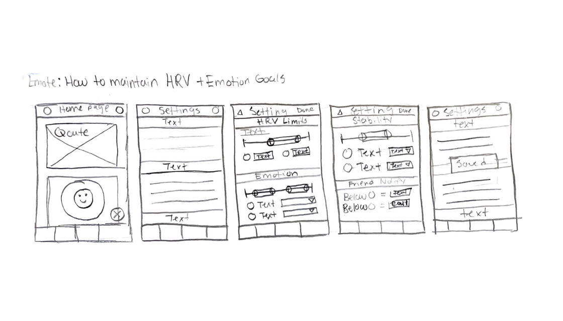
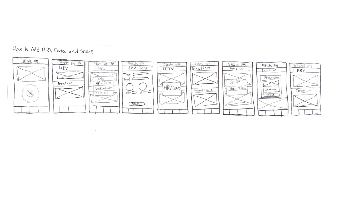
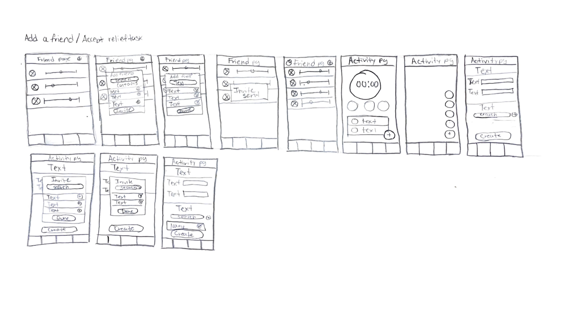
Social Enterprise Thinking Encourages Human-Centered Design thinking for E-motion

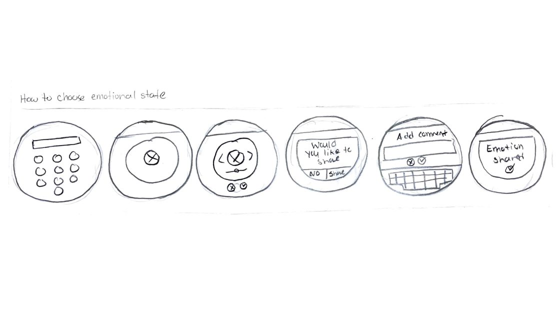
Social enterprise thinking involves using business tools to address social needs and create positive change. This approach was employed to develop a solution for E-motion, as it is inherently human-focused and the project had a significant social component. To complete this project effectively, the human-centered design approach was used as a framework for each step of the design thinking process.

Wireframe Ideation
Facilitated the Structuring of the User Interaction and Experience

Wireframe ideation was conducted to visualize and structure the user interaction and experience for the digital elements of the solution. This process aimed to clarify how page content for both the app and the diffuser would be organized. The ideation was completed in two phases: initial sketching of page layouts followed by the creation of refined low-fidelity digital wireframes.

The initial phase involved sketching wireframes based on the task flows, which helped brainstorm and visualize the layout, interactions, features, and content for each page. This resulted in hand-sketched wireframes that outlined the structure of each primary feature, providing a foundational understanding of the user interface.

The refinement phase transformed the initial sketches into low-fidelity digital wireframes. Using the final user flows, the necessary pages were identified and incorporated into the wireframes. This process ensured that all options and steps in the user journey were covered. The refined wireframes effectively visualized the layout, interactions, and content for each page, providing a clearer representation of the user experience.

App
Diffuser
Brand Research
Uncovers Key Aesthetic Insights and Inspire UI and Design Choices

The brand research focused on identifying a company for E-motion to emulate in their design choices for the user interface (UI) of the mobile app and diffuser. Apple was selected as the primary inspiration for UI design, while Philippe Starck’s products were examined for material and texture insights. This research aimed to inform and enhance the final design solutions by integrating key elements from these sources.

For material and texture inspiration, Philippe Starck’s products were reviewed, particularly those with similar forms and functions to the diffuser. This research guided the selection of materials likely to complement the design and enhance the product's aesthetic and functional qualities.

The research into Apple’s UI design led to five key findings: color schemes, border styles, elevation techniques, iconography, spacing, and element shapes. These elements provided a foundation for creating a cohesive and modern user interface for both the mobile app and the diffuser.

Diffuser Prototype
Was Created to Demonstrate the solution's Design, Form, and Functionality

A prototype was developed to present the diffuser solution to the client. This process involved three key steps: creating rendered sketches, 3D modeling the prototype and its internal components, and constructing a life-size model. The final step included producing digital renders to effectively showcase the diffuser’s form, design, functionality, and features.

Digitally rendered sketches were created, incorporating material inspirations from the designer's research to align with the desired aesthetic. These sketches provided a visual reference for the prototype's form and design.

3D modeling was employed to design both the internal and external components of the diffuser. This modeling resulted in detailed and accurate representations of the parts, which were then rendered based on the final sketches. The design incorporated material inspirations from the research phase.

The physical prototype was crafted using renfoam and styrofoam, covered with sandable plaster for a smooth finish, and then painted. Due to material constraints, the prototype was constructed as a single unit.

Product fostered Stakeholder Enthusiasm for Development and Monetization

Overall, the project was a success. The digital prototype effectively represented the key features of both the physical and digital solutions, and it was very well received by stakeholders, who were eager to start the development process.

This project underscored the importance and value of mental health. Stakeholders expressed, that the diffuser’s approach to emotional awareness and stress relief methods could have the potential for collaboration with brands like Headspace and Calm.

Despite the prototype being of lower fidelity than initially planned, stakeholders felt that it still showcased the potential of the product. This project also highlighted an opportunity for the mobile application to be monetized for therapist-to-patient communication and monitoring.