User Experience Design for Fitness Brand

User Experience Design for Fitness Brand

Run Across America Revamps Mobile App to Enhance User Experience and Boost Customer Retention

Client

Run Across America (RAA) is an online fitness company that organizes community-oriented races for its users. By hosting running events and challenges, RAA raises support for causes that they and their community care about. RAA is focused on improving its product experience to increase revenue, allowing it to support its users and expand its user base.

Problem

RAA has identified friction in its mobile app and aims to address these issues by identifying and resolving pain points in its user experience and interface design. By doing so, RAA aims to enhance customer retention to improve their return on investment when marketing its running events.

User & Audience

This project targeted Run Across America's existing customers who actively participated in their running events, with a focus on previous customers who did not participate in recent running events.

Scope & Constraints

The project began with a request to identify problem areas in the RAA mobile app interactions and provide solutions for a more user-friendly experience. Initially, the scope was incomplete, but once defined, it became limited due to a tight timeline and budget. This constraint made it challenging to gather insight from customers to improve the app experience.

Role & Responsibilities

As the sole designer for this project, I worked closely with the founders and the marketing manager to make critical design decisions that would effectively support their business and its users. My responsibilities encompassed user research, competitive analysis, facilitating workshops and progress reports, developing wireframes and prototypes, and presenting the deliverables and the overall user experience.

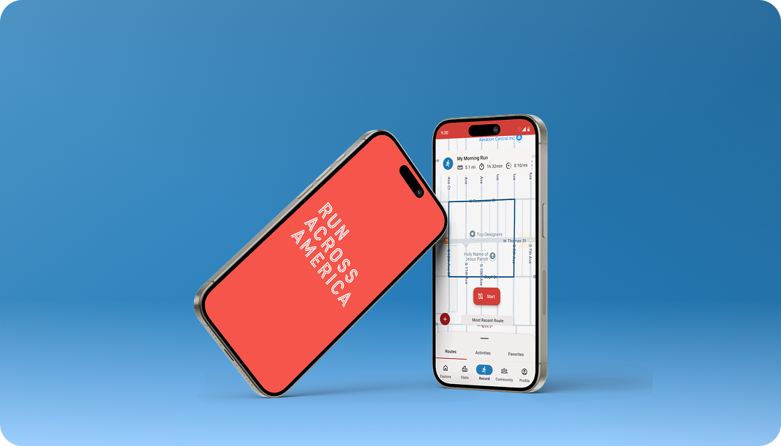
Design Thinking Method Was utilized to identify RAA’s Mobile App Challenges, User Requirements, and Business Objectives

The five stages of the design thinking approach proved invaluable for identifying and addressing pain points in the RAA mobile app. The empathize and define phases of this methodology were particularly effective in gaining insights into both users and clients. Despite a tight timeline, this method provided an excellent framework for understanding RAA's users, competitors, and market positioning.

Prototypes
Showcase Redesigned Onboarding and App Architecture

The goal of this step was to present the outcomes of our process to stakeholders. We prepared a presentation detailing the project’s initial goals, research findings, and final solutions. This included a clickable prototype of the redesigned onboarding flow, high-fidelity wireframes for the app’s restructured architecture, and highlights of the brand guidelines and design system.

The final prototype of the onboarding experience was presented and accompanied by wireframes that explained each step in detail.

The original sitemap was compared with the revised version, using high-fidelity wireframes to highlight improvements in structure and content placement.

The essential brand guideline elements were highlighted with a brand guideline book, demonstrating how they aligned with stakeholder decisions.

The application of the design system in the wireframes was demonstrated, illustrating how it acts as a foundation for future development. The design system combined Google's Material Design with unique UI elements to align with the brand guidelines.

Scope alignment enables the achievement of project objectives and results in positive feedback.

The project received positive feedback overall. Despite the undefined scope, we successfully redesigned the mobile application to address the original goal of removing friction from the user experience. The onboarding template was utilized for the upcoming running event, although the remaining designs were deferred for future development.

This experience highlighted the importance of clearly defining objectives and requirements, as well as establishing a well-defined path to achieve the desired outcomes.

Reflecting on the project, I recognize that a deeper exploration of the goals and clearer time expectations would have been beneficial. This approach would have allowed for a more thorough discovery phase, providing the necessary insights to create designs that effectively addressed the most pressing concerns.